

There's no getting around it: we are now firmly ensconced in the visual age. Where once it was all about the word, today it's all about the image. Photographs have become as much a part of our lives as the social media tools that capture them.
This is perhaps because, in a world cluttered by information, visuals simplify life. They cut across languages and borders, not just geographically and linguistically but also aesthetically. They are the default alphabet of our modern life.
This is perhaps because, in a world cluttered by information, visuals simplify life. They cut across languages and borders, not just geographically and linguistically but also aesthetically. They are the default alphabet of our modern life.
In fact, our visual intelligence is now so refined that many of us are communicating largely by images rather than words. We are even able to recall the images we've seen, much like conversations. An ex-Vogue friend in Sydney has a remarkable recall: she can look at an old image and pinpoint which designer / website / book / magazine / fashion collection it came from, OR the era / year / book / film / designer it was inspired by. (From what I hear, Vogue staffers had to have such encyclopedic minds. They were all walking reference libraries.)
CLICK ON ALL IMAGES TO ENLARGE THEM
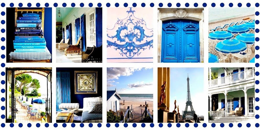
(Top grid of images from my website.
Second grid of images above from a forthcoming London guide book, currently in production.)

I love the beautiful and refreshingly original website / blog by former New York creative director-turned-author Amanda Brooks, who wrote the book I LOVE YOUR STYLE. (LINK HERE) Her newly re-designed layout is wonderfully image-rich but it's the way she configures the content around the visuals that's really inspiring. Just look at her 'visual board' on writer / gardener Vita Sackville-West above. Genius.
Amanda is almost religious about images -- her photographs of life at her Oxfordshire home Fair Green Farm are pure poetry for the weary, visual-ed-out soul -- and because of this, she has just picked up a new book deal with Penguin. Clearly, her discerning eye for images has caught the eye of some discerning editor, somewhere.
A few other writers, designers and bloggers who are skillful at imagery include Ben Pentreath (LINK HERE; scroll down to his garden pix for the best eye candy), Tory Burch, Mark D. Sikes and India Hicks.
In the following paras, I'll show you just how influential images have become in our lives, particularly in the world of books. (Certainly illustrated books.) You'll see why visuals really are leading the way in the modern world.

IN THE BEGINNING...
For a long time, I was a word girl. A journalist. Visuals were something the photo editors took care of Then, I began contributing articles to Australian Vogue Living as a freelancer (not as the editor, as stated in a publisher's blurb recently). The Melbourne editor, Helen Redmond, was famously lovely, but I'll always remember something she once said to me. We were talking about Vogue and Vogue Living's high production values and she said that any intern who worked for them needed to be so aesthetically savvy that they could be trusted to go to the markets and find "ten perfect potatoes", if the need arose. (This was in the days when Vogue Travel and Entertaining was part of the Vogue stable.) Isn't that fantastic? I've always remembered that. Ten Perfect Potatoes. It was the design version of ISO 9001:2015.
It was then that I realized that the 'look' of something can be as important as the story and the words around it.
Now I remembered this quirky Vogue mantra recently because for the past few weeks I've been trying to design several books. And often I've felt I've not been living up to the 'Perfect Potato' standard.
Here's how I got through.


STEP ONE: STUDY THE BEST
When you're struggling with anything at all, study the best to see how the pros do it. One of the best photographers and visual manipulators around (in my insignificant opinion) is the New York-based Australian photographer Robyn Lea.
Robyn's book The Milan Book, above, is a visual work of art. A publishing masterpiece.
Here are some page designs, above and below...

There's a fantastic video about how the book was produced from Robyn HERE, but there's also fascinating post about how it was designed HERE.
The pages of this sumptuous tome feature (wait for it) varnishes, laser cuts, UV varnishes, almond scratch and sniff varnishes, hot stamps, reliefs and bas-reliefs, black silk screen prints details, letterpress inserts and silver laminations, among other effects.
Incredible. And that's not even touching on the beautifully composed photographs.


Robyn (who is a new friend, so I hope she doesn't mind all this!) has also recently produced the bestseller Dinner With Jackson Pollock: Recipes, Art & Nature, published by Assouline (2015).
This is another extraordinarily beautiful book where the images have -- as you'd imagine with a book about Pollock -- taken centre-stage.
I particularly love the juxtaposition of paints / pastels and receipts / food.
It's beautiful, and very, very clever. No wonder it's been a good seller.

STEP TWO: RESEARCH VISUALS; UNDERSTAND WHY THEY WORK
Now it's one thing to look at pretty pix; it's another thing to understand why they affect us so much? One of the reasons is that images tell a story, mostly through their composition but also through their layers, colours, patterns and lines. The best images are as carefully put together as any photo shoot directed by Grace Coddington.
Look at the stills for the BBC's new series on the Bloomsbury Group, A Life in Squares, above. I loved this image because it shows everything from the wicker chairs loved by the Edwardians to the pragmatic colour palette preferred by writers and artists and gardeners at this time. Images like this offer invaluable insights into how visuals are put together, whether for a book or a film. They show how the designers and producers are aiming for integrity as much as beauty.


STEP THREE: COLLATE YOUR OWN FILES AND PILES
The next step is to gather your own inspiration, for whatever project you're working on. (Or even for your own personal files.) You may think you'll never need your carefully curated visuals for anything. But I'll show you why you will.
Recently, I've been designing the pages for my illustrated biography about Joan Lindsay and Picnic at Hanging Rock. The biography covers the years 1896 to 1980, but the main section focuses on the Edwardian years, so I had to understand Edwardian aesthetics and even Edwardian colour palettes. The BBC series, A Life in Squares, above, helped to clarify the 'style' of writers and artists in this age, and the lovely Charleston magazine further confirmed the style. (Isn't this a gorgeous cover?)
I then crystallized this colour palette using roses from our garden. (I was dead-heading one morning, and they seemed too pretty to waste! This rose page eventually became the Acknowledgement page.)

Then I came across these visuals on my Instagram feed (left image from Carolyn Quartermaine's Instagram; right via Rivkah1981's Instagram), which showed just how beautiful the colours green and yellow can be. (NB Yellow is set to be big in fashion in 2016.) I realized then that yellow would brighten some of the pages of this biography, especially those that featured old sepia photos, as sepia photos can often look 'dull' if too many are stacked together.
Yellow and green are also the colours of Australia, so they seemed fitting for a biography about a major Australian author and her iconic Australian novel. (They are also the colours of the Australian countryside in summer, which is when Picnic at Hanging Rock was set.)
Yellow and green are also the colours of Australia, so they seemed fitting for a biography about a major Australian author and her iconic Australian novel. (They are also the colours of the Australian countryside in summer, which is when Picnic at Hanging Rock was set.)

But even then, the shade of yellow was wrong. This is the title page. The daisies were a reference to picnics, but it was all wrong. (The ferns are a mural in Joan Lindsay's writing room.) This was an early page design that was relegated to the bin.


So then, I went back to that old fail-safe: the collage.
I ended up configuring some simple, pared-back collages that featured Joan and people she knew -- Sir Laurence Olivier; the Murdochs; Dame Nellie Melba -- and the Edwardian picnics she went on as a girl to Hanging Rock. But you can see that it still featured the greens and golds, albeit in a softer way.
In the end, the book featured an unusual palette: leaf green, yellow/gold, pale pink, plum, sky blue and beige/grey (for the old photographs). I would have never thought it would work, but it does, because they're not only the colours of Joan's Edwardian childhood, when she set Picnic at Hanging Rock, but also the colours of the countryside where she lived as an adult; the sky; the landscapes, and her beloved garden and the flowers.
So you can see how images and visuals come into play in all sorts of different ways. If you really want to see how the professionals do it, however, have a look at the wonderful behind-the-scenes videos about the design of The Milan Book, by Robyn Lea, (outlined above), which show the detail that goes into designing books. Of course, sometimes it doesn't all go to plan. I hated one of my recent guidebooks, especially the headers! But you live and learn. Design is also a subjective thing. Certain images appeal to certain people, while other images take a while to like. And that's what makes the visual world so interesting. We're all on a vertical learning curve in this education of aesthetics. The Perfect Potato, indeed.
No comments:
Post a Comment
Thank you for stopping by. It's always lovely hearing from The Library's readers.